
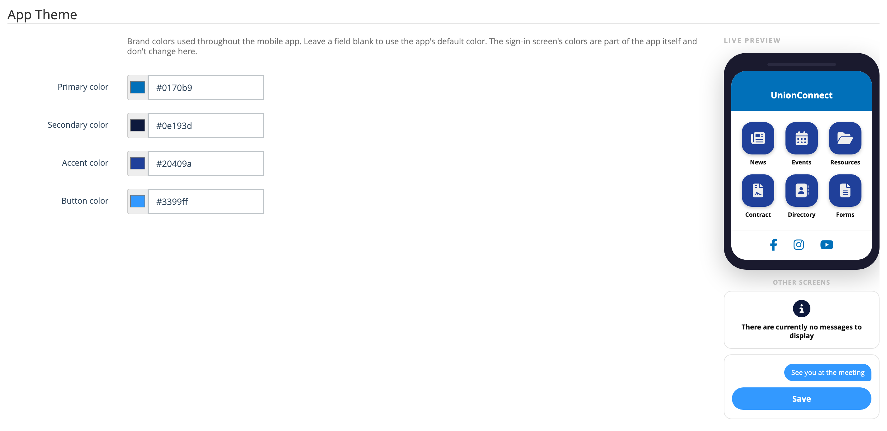
The App Theme settings let you match the mobile app to your union’s brand by choosing the colors used throughout the app — the header bar, the home-screen menu tiles, icons on list screens, and the action buttons and chat bubbles on screens like Profile and Chat. A live preview shows your changes on a phone mockup as you make them, so you can see the result before you save.
App Theme is available on every local. You need permission to edit your local’s settings to use it.
Opening the App Theme settings
- Login to the app manager
- Go to Local → Edit local
- Click the Options tab
- Scroll down to the App Theme section

The App Theme section
The section has two halves: the four color controls on the left, and the Live preview phone mockup on the right.
Choosing a color
Each of the four colors has two controls that stay in sync with each other:
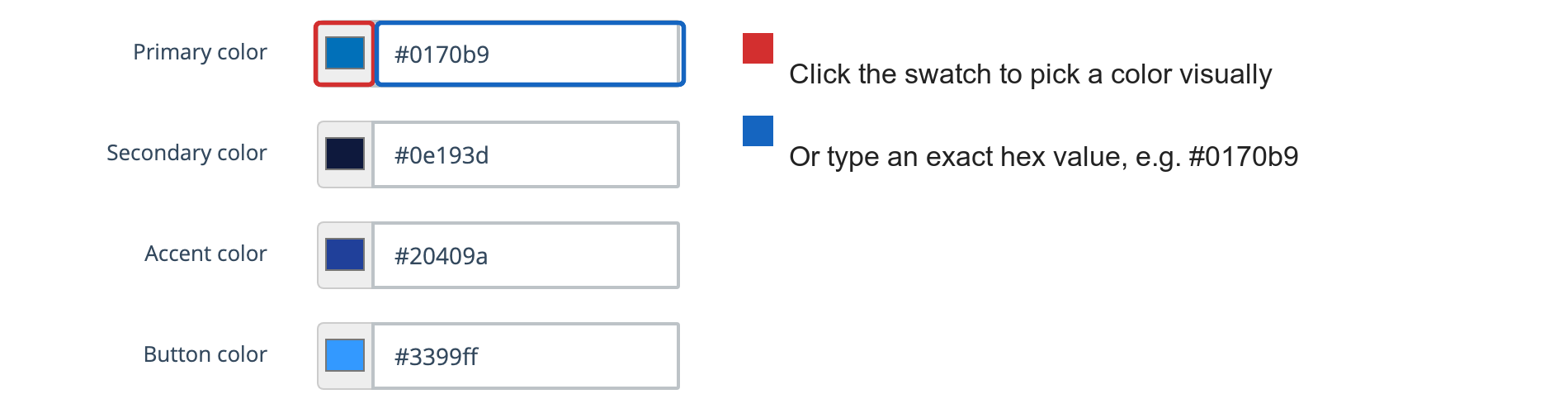
- The swatch on the left — click it to open your computer’s color picker and choose a color visually. The hex box updates to match.
- The hex box on the right — type an exact color value, such as
#0170b9. The swatch updates to match.
Hex values must start with # and use either six characters (#0170b9) or the three-character shorthand (#0b9). If you enter anything else, the page will show an error when you try to save and the color will not be stored.
Going back to the default
Leave a color blank to use the app’s built-in default. To reset a color you’ve already set, clear the hex box and save — the box then shows the default as faint placeholder text. Note that the swatch always displays a color, so clearing the hex box (not the swatch) is how you return to the default.
The built-in defaults are:
| Color | Default |
|---|---|
| Primary color | #0170b9 |
| Secondary color | #0e193d |
| Accent color | #20409a |
| Button color | #3399ff |
What each color changes
| Color | Where it appears in the app |
|---|---|
| Primary color | The header bar across the top of app screens and the social-media icons on the home screen. It’s also used for icons and highlights on the Profile and Work Info screens. |
| Secondary color | Status and information icons on list screens such as Messages, FAQs, and Job Opportunities — for example, the icon shown when there are no messages to display. |
| Accent color | The home-screen menu tiles — the colored boxes behind the News, Events, Resources, Contract, Directory, and Forms icons. |
| Button color | The action buttons throughout the app — saving your profile, sending a chat message, and so on — and the bubbles behind the chat messages you send. |
Text, headings, and background colors are not adjustable — they’re fixed by the app so that content stays readable no matter which brand colors you choose.
The sign-in screen does not change. Its colors, including the Sign In and Sign Up buttons, are built into the app itself, because the app doesn’t know which local a member belongs to until they sign in. None of the App Theme colors affect it.
Using the live preview
The phone mockup on the right recolors instantly as you change each color, so you can try combinations before committing to them. It shows a sample home screen — header bar, menu tiles, and social icons. Below it, under Other screens, are examples from elsewhere in the app: the icon from an empty Messages screen (Secondary color), and a chat bubble and Save button (Button color).
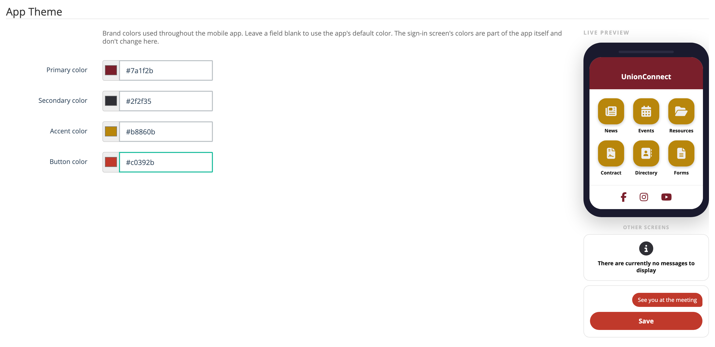
The preview is a close approximation, not an exact copy of every screen. Once you’ve saved, it’s worth opening the app on a phone to check how the colors look in practice.
Saving your colors
App Theme colors save together with the rest of your local’s settings. Scroll to the bottom of the page and click Update. Changing a color in the preview alone does nothing until you save.
Members see the new colors the next time they open or sign in to the app. They do not need to update or reinstall it.
Tips
- Start with your union’s official brand colors for Primary and Accent — those two do the most visible work.
- The menu tile icons, button labels, and the text of members’ own chat messages are white, so pick Accent and Button colors dark enough for white to read clearly against them. Very light or pastel shades will wash out.
- You don’t have to set all four. Change only the ones you need and leave the rest blank to use the app’s tested defaults.
- Check the result on a real phone after saving, in both bright and dim lighting.